Introduction
On the previous blog, We have created a simple logo, then made a base “Sidebar” component. I encountered no problem with those. I will be resuming with the Youtube tutorial.
Steps
For this day I decided to start with programming the styles (scss) for the ‘Sidebar’ component. This would include some simple animations.
Resuming with ‘Sidebar’ component
- Append the following file: ’tiukenywil11_portfolio/src/components/Sidebar/index.scss’.
- Add style to ’nav-bar’ class.
.nav-bar {
	background: #000000;
	width: 60px;
	height: 100%;
	position: absolute;
	top: 0;
	z-index: 3;
	min-height: 500px;
}
- Inside ’nav-bar’ class, nest ’logo’ class.
.logo {
	display: block;
	padding: 8px 0;
}
- Inside ’logo’ class, , nset ‘img’ tag.
img {
	display: block;
	margin: 8px auto;
	width: 24px;
	height: auto;
}
- Below ’logo’ class create ’nav’ tag style.
nav {
    display: block;
    text-align: center;
    position: absolute;
    height: 210px;
    top: 50%;
    margin-top: -120px;
    width: 100%;
}
- Inside ’nav’ class, nest ‘a’ tag.
a {
	font-size: 22px;
	color: #ffffff;
	display: block;
	line-height: 51px;
	height: 51px;
	position: relative;
	text-decoration: none;
}
- Inside ‘a’ tag, nest ‘i’ tag.
i {
	transition: all 0.3s ease-out;
}
- Inside ‘a’ tag add ‘hover’ animation. (Added gray color upon hover)
&:hover {
	color: #808080;

	svg {
		opacity: 0;
	}

	&:after {
		opacity: 1;
	}
}
- Inside ‘a’ tag, add animations on ‘after’.
&:after {
	content: '';
	font-size: 9px;
	letter-spacing: 2px;
	position: absolute;
	bottom: 0;
	display: block;
	width: 100%;
	text-align: center;
	opacity: 0;
	-webkit-transition: all 0.3s ease-out;
	transition: all 0.3s ease-out;
}
- Below ‘a’ tag style, add color when button is active. (Added light gray color when active)
a.active {
	svg {
		color: #d3d3d3;
	}
}
- Below ’nav’ class, add ‘ul’ tag style.
ul {
	position: absolute;
	bottom: 20px;
	width: 100%;
	display: block;
	padding: 0;
	list-style: none;
	text-align: center;
	margin: 0;
}
- Inside ‘ul’ tag, add empty ’li’ tag style.
li {

}
- Inside ’li’ tag, add ‘a’ tag style.
  a {
	padding: 7px 0;
	display: block;
	font-size: 15px;
	line-height: 16px;
	color: #4d4d4e;
}
- Inside ‘a’ tag, add a ‘hover’ design. (Added gray color upon hover.
&:hover {
  color: #808080;
}
- Append ’tiukenywil11_portfolio/src/components/Sidebar/index.js’.
- Append import from ‘react-router-dom’. Add ‘NavLink’
import { Link, NavLink } from 'react-router-dom';
- Import from ‘@fortawesome/react-fontawesome’.
import { FontAwesomeIcon } from '@fortawesome/react-fontawesome';
- Import icons from ‘@fortawesome/free-brands-svg-icons’.
import {
	faLinkedin,
	faGithub,
} from '@fortawesome/free-brands-svg-icons';
- Import icons from ‘@fortawesome/free-solid-svg-icons’.
import { faHome, faUser, faEnvelope } from '@fortawesome/free-solid-svg-icons'
- Add ’nav’ tag below closing ‘Link’ tag.
<nav>

</nav>
- Add ‘Navlink’ tag inside ’nav’
<NavLink exact="true" activeclassname="active" to="/">
</NavLink>
- Add ‘FontAwesomeIcon’ tag inside ‘NavLink’ tags.
<FontAwesomeIcon icon={faHome} color="#ffffff" />
- Duplicate 2 more times for ‘about’ and ‘contact’ links.
<NavLink exact="true" activeclassname="active" className="about-link" to="/about">
	<FontAwesomeIcon icon={faUser} color="#ffffff" />
</NavLink>

<NavLink exact="true" activeclassname="active" className="contact-link" to="/contact">
	<FontAwesomeIcon icon={faEnvelope} color="#ffffff" />
</NavLink>
- Add ‘ul’ tag with ’li’ tag inside, below ’nav’ tag.
<ul>
	<li>

	</li>
</ul>
- Add ‘a’ tag inside’li’ tag. These will contains links to social media accounts.
<a target="_blank" rel="noreferrer" href="https://www.linkedin.com/in/kenywil-tiu-0b6a4612b">
	<FontAwesomeIcon icon={faLinkedin} color="#ffffff"/>
</a>
- Duplicate 1 more times for ‘github’ account.
<li>
	<a target="_blank" rel="noreferrer" href="https://github.com/tiukenywil11">
		<FontAwesomeIcon icon={faGithub} color="#ffffff"/>
	</a>
</li>
- Append ’tiukenywil11_portfolio/src/components/Layout/index.js’.
- Import ‘Sidebar’ component.
import Sidebar from '../Sidebar';
- Add ‘Sidebar’ tag on ‘Layout’ component.
const Layout = () => {
	return (
	<div>
		<Sidebar/>
	</div>
	)
}
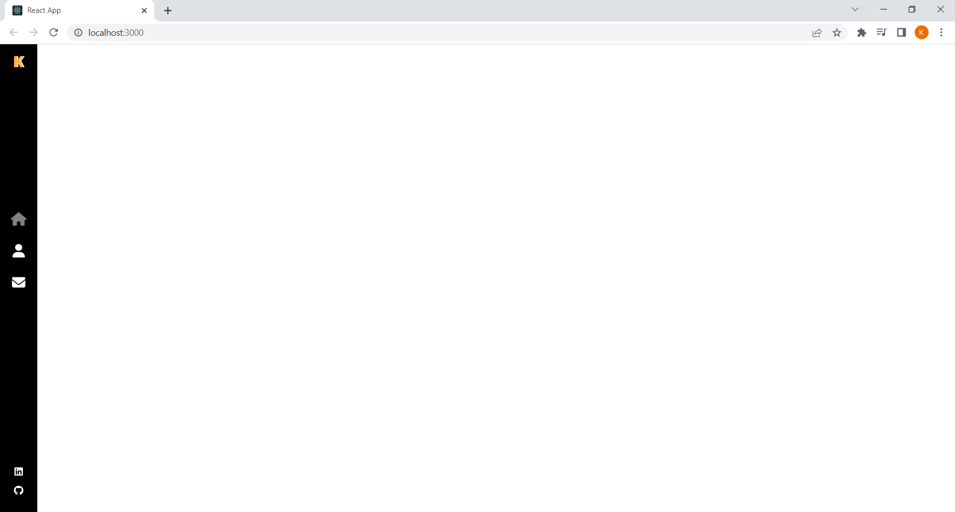
- Test if ReactJS app is workin.
npm start
- The screen should look similar to this.
Outro
The progress I made today adds the ‘Sidebar’ component and its style. I had encountered a few problems when nesting the scss for ‘Sidebar’ component. I learned to simply model the nesting similar the HTML element.
Example:
- HTML element
<ul>
	<li>
		<div className="sample"></div>
	</li>
</ul>
- SCSS element
ul {
	/* css for 'ul' tag */
	li {
		/* css for 'li' tag */
		.sample {
			/* css for 'sample' class */
		}
	}
}
The changes can be found in my GitHub repository here.
Read More:
Previous:
Decentralized Portfolio: Introduction
Decentralized Portfolio: Part 1
Decentralized Portfolio: Part 2
Decentralized Portfolio: Part 3
Decentralized Portfolio: Part 4
Next:
Decentralized Portfolio: Part 6